The story of our logo
The story of the VIETOR® logo: "From the hands of a boy to the world of transport"
When VIETOR® was founded in 2000, it had big ambitions - to build a fast, reliable and internationally connected transport service. But the logo, which is now familiar to every partner or customer, was not created in a marketing agency, but... in a child's bedroom.The author of the original logo design was just a 6-year-old boy. With a strong imagination, pure intuition and a pencil in hand, he drew a shape that evoked speed, wind and movement - everything that the VIETOR® brand stands for. His drawing has become the basis of a visual identity that has survived for more than a quarter of a century.

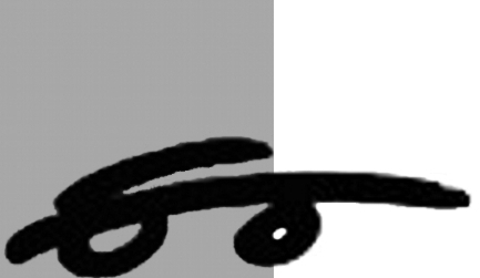
2000 - The first VIETOR®
"Drawn by hand, guided by the heart."A simple drawing by a six-year-old boy. The logo, which was born out of imagination, has become the carrier of the corporate identity.

2013 - Professionalization of the brand
"Preserve the soul, add precision."A modern version of the logo was born. The blue lines and precise typography symbolise movement and international reach.

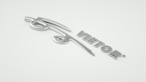
2016 - 3D experiment
"A bold step into the depths of design."Metal 3D logo as a symbol of technological vision. Unused, but inspiring.

2025 - Official trademark
"Our VIETOR® is now protected."The logo has been officially registered as a trademark by the Industrial Property Office of the Slovak Republic. A symbol of stability, trust and originality.
More than just a logo
The VIETOR® logo is not just a mark on paper. It is a story of faith that even children's ideas can power the world. It's a reminder that behind every successful company there is a very ordinary but extraordinary beginning.And that's why even today - when VIETOR® transports goods across three continents and more than 45 countries - you can still feel the VIETOR® spirit of 2000.


